

How To Lie With Charts and Graphs

As Mark Twain wrote:
Figures often beguile me, particularly when I have the arranging of them myself; in which case the remark attributed to Disraeli would often apply with justice and force: “There are three kinds of lies: lies, damned lies, and statistics.”
Visualizing data in the form of charts and graphs is a language. And language requires study.
But just as anyone with two fists (wrongly) thinks they can fight, so too anyone with two eyes seems to think they can read the language of data viz. Maybe it’s just my timelines, but charts and graphs seem to go viral far more often across all social media than any other type of content. In a low-literacy world, that’s perilous.
Take this chart, shared among Finance Bros this week to celebrate the glories of capitalism:
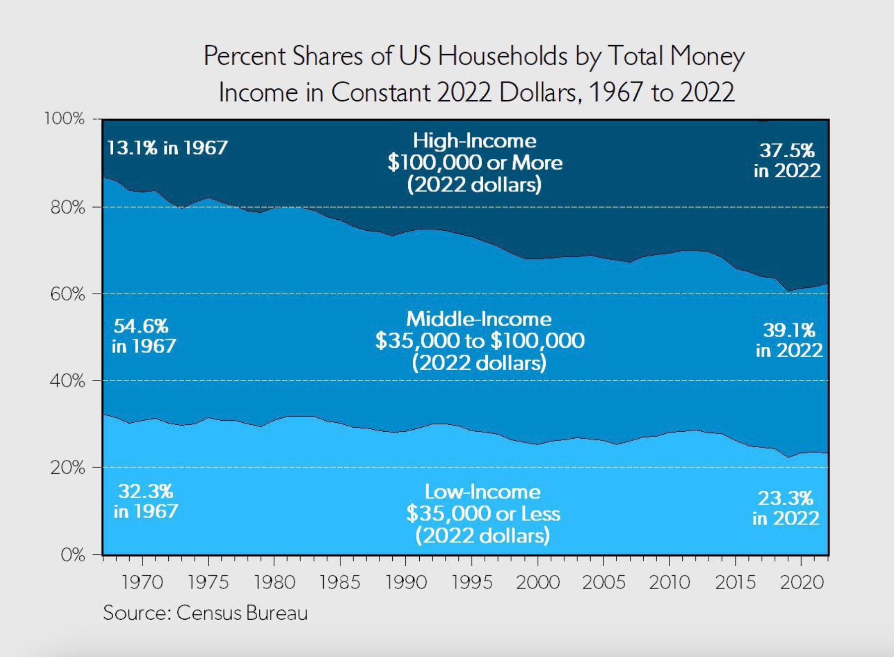
When they look at this chart (which one of them made), they see proof that capitalism since the 1960s has reduced the number of low-income people and increased the number of high-income people. It’s easy enough to see how a money-chaser could come up with this interpretation while scrolling on a toilet, but it’s wrong on multiple levels.
First, these categories are arbitrary. That matters because not only do these categories not represent class divisions; there is also no universe where a guy who makes $110k/year and a guy who makes $110 million/year should be in the same category.
Second, the chart does not account for cost of living, ie, inflation based on the Consumer Price Index.
Third, the measure for “total money income” in their data set excludes capital gains and inheritance. Seems important!
Fourth, the data used to populate the chart measures income (flows), not wealth (stock). Inequalities of both are a problem, but accumulated stocks of wealth are the basis of oligarchy—the conversion of wealth into political power. That is the main anti-capitalist line of critique the Finance Bros are trying to push against.
Finally, the top category in the chart excludes/erases how extreme even income inequality has become. You would never know by looking at this chart that less than 1% of households account for 22% of national income (or more than 1/3 of wealth). And the top 1% of income earners earn more than 6x the threshold for the top category in this chart.
Add all this up, and the chart is a dumb-guy bullet fired from the wrong side in a class war. It’s a piece of sophistry. And we can see it as such because it distracted from two other charts that were circulating that same day.
The first showed that loan delinquencies of all types are currently up to levels not seen since the Global Financial Crisis:

The second showed that workers are now taking home the smallest percentage of America’s economic output since 1947 (when records began).

It’s more than coincidence, then, that corporate profits are now also at the highest point since 1950:

There’s a lesson in all this, and I don’t just mean that people use statistics to lie.
In one of Antonio Gramsci’s lesser-known works, he made an epistemological claim that I used to have a lot of trouble with. He said, in effect, that knowledge about power and society comes from having a partisan stance, by which he meant that the process of making analytical claims requires the analyst having a position or a stake in it (especially with reference to the balance of forces between capital and labor). If you’re like me, you were almost certainly taught the opposite of this in your rational-liberal-positivist PhD training. But the thing is, if you don’t know yourself in the way that Gramsci suggests—as a political animal—you can’t actually know anything meaningful about politics.
After puzzling over this for a long time, what this has come to mean for me is that, if you think of yourself on the side of “the good,” you must see power from the standpoint of its victims. If that’s not what orients your analysis, then you may well be a fool for someone else’s agenda.
In visualizing the economy, I might translate Gramsci’s insight this way: If you’re talking about the economy but not about its k-shape, unemployment, asset inflation, cost of living, or debt and bankruptcies, you’re distracting from the immiseration associated with the real economy. That was a fatal error in the Biden/Kamala campaign of 2024. Who next shall make that mistake?
Hey, friend! You might have noticed that I’m offering more of Un-Diplomatic without the paywall; I’m trying to keep as much as possible public. But to do that requires your help because Un-Diplomatic is entirely reader-supported. As we experiment with keeping our content paywall-free, please consider the less than $2 per week it takes to keep this critical analysis going.
"Add all this up, and the chart is a dumb-guy bullet fired from the wrong side in a class war. It’s a piece of sophistry." -- love that word. Doesn't get used enough in modern day parlance. 🫡